
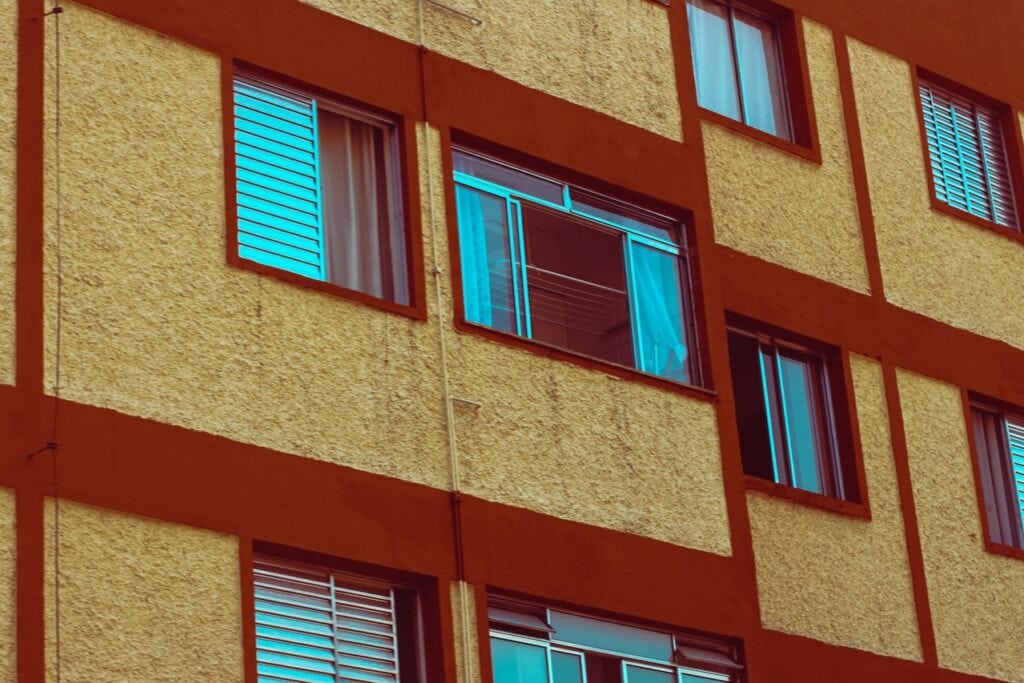
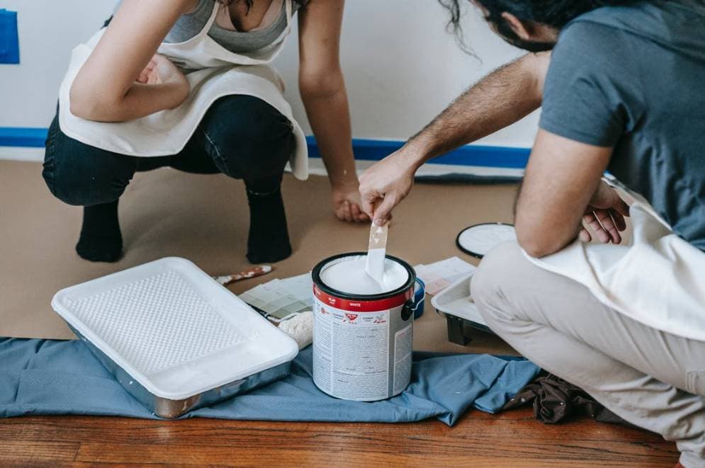
Just by repainting a room, you can make it feel more modern and reflect your personality. In order to save money or to create a custom colour, painting is a great and easy way to give your home a facelift.
Several techniques exist for the art of painting. You can use any brand or colour you like for the interior paint as long as they are all the same quality. By separating the colour mixture into its own container, you can control the final color's consistency and achieve a uniform appearance.
If you're in a similar financial position to me and have almost no budget at all, mixing your own paint is a great way to save money on the cost of your decorating project.
It's not hard to make your own paint, and doing so opens up a world of opportunities for reusing paint from previous projects and making use of paints that are nearing the end of their shelf life but are still the right colour but not the right shade. DIY paint is easy to make by mixing the necessary ingredients.
There is no requirement for specialised mixing tools or drill attachments, but you will have them available if you prefer to use them. In order to complete this task, all you need is a paint stick and some determination. Keep in mind that you can only combine different types of latex and oil of the same type.
You must remember this above all else. In no circumstances should you ever mix oil-based and latex or water-based paints.
Planning for a new look for your house? Look no further! Hitch Property Constructions is here to help in your home renovations.
How to Mix Custom Paint Colors
Need some help figuring out how to mix your own special hues of paint? In the following tutorial, you will discover how to alter the hues of your paintings on the cheap with the help of craft colourants.
Have you ever bought the wrong colour of paint for your house and been stuck with it? I was wondering if you happened to have a can of screaming yellow paint in your garage that you could spare me. Or maybe you visited your local hardware store and saw a gallon of paint for $5, but the colour was so dull you decided against buying it.
Developing your own one-of-a-kind colour palette could be the answer. You should make an effort to modify the colour of the "wrong" paint before giving up and throwing it away.
You can save the paint and use it for your home painting project, which will help you save both time and money.
To Change the Paint Colours, You Will Need:
- a colour wheel for use in painting (a.k.a. the colour wheel)
- Alkyd paints use oil-based colourants, while latex and acrylic paints use acrylic colourants.
- The use of white paint (in the same sheen as the starting point)
It's important to keep in mind that when mixing your own custom paint colors, you'll probably only be able to get fairly close to the exact shade you're going for.
Color achieved will be close to desired shade, but may not be an exact match.
It all comes down to the base color, your skill with colour mixing, and the available colourants to achieve the desired effect.
The paint base also affects how much a colour can be lightened or darkened.
Lighten Up the Color
To make a colour appear lighter, you must mix it with white paint. Depending on the darkness of the original paint colour and the desired degree of lightening, the amount needed will vary.
However, it usually takes a substantial amount of white paint to noticeably lighten up a paint colour.
It may be more rational to begin with white paint as well as add the starting point rather than to begin with white paint and add a few cups of starting paint.
The cheapest way to "stretch" paint is to use lighter colours; white paint is cheap, so this is a viable option. You might find that you have some white paint in the garage from a previous project.
Darken Custom Paint Colours
Make a colour darker by mixing in some grey or black dye. The blues and purples in your colour palette will benefit greatly from this. Black should be used with very dark colours, while grey should be used with lighter colours.
Simply adding a small amount of black can significantly deepen the saturation of a pastel. To achieve a noticeable change, however, numerous colourants will be required.
Keep your colour palette within two shades of the primary colour. To try to change a pale sky blue into a dark navy blue is a waste of time and energy.
Intensify Custom Paint Colours
To make the custom paint colour you mixed look more vibrant, you'll need to use more of the base colour.
Make a boring colour like tan more exciting by adding yellow or orange to it. To make sage green more vibrant, just add more green.
Tone Down the Color
When a color's complement is introduced, the original hue's vibrancy is muted.
For instance, a violet colourant can be added to a vibrant yellow to tone it down and make it appear more refined.
Change the Hue
Colours can have their tones, undertones, and even hues adjusted. For instance, yellow can be added to green to make moss green, and blue can be added to green to make it cooler.
Add some blue to the red, and you get violet. Please consult the paint colour mixing chart for more details.
Keep in mind that it is more difficult to change paint colours that already contain a lot of different colors, like browns, beiges, and greys, because of all the different undertones present in those hues.
Changing the look of less complicated colours like greens, yellows, blues, and so on is usually less difficult.
It is recommended to experiment with mixing custom paint colours in a smaller container before adding colourant to a full-size can of paint. Don't forget to mix everything together thoroughly!
Tips for Mixing Your Paints
It's not often that a project uses every last drop of paint that was bought. Some of the colours will be good for touch-ups, while others might be from abandoned projects that were painted over years ago. Use the extras to make a shade that is truly your own.
At Hitch Property Constructions, we offer Melbourne home painting services. We've provided the following guidelines on how to blend ingredients more effectively:
Keep within the same brand.
Due to formulation differences between manufacturers, combining paints from different brands can lead to lumpy or separated paint in the bucket and patchy coverage when applied to the wall.
Similarly, vigorously stirring the paint can cause this. It's more likely that the two paints will blend seamlessly if they come from the same manufacturer, so keep that in mind when making your selection. Better yet? Keep in the same line we've established.
Avoid outdoor paints
These are built to withstand the elements for a long time, so they won't get damaged by the rain or dirt, but they might get stained if you spill red wine on them or use spaghetti sauce or marker inside.
More solvents, known as volatile organic compounds (VOCs), are released into the air as paint dries, making outdoor paints more likely to give off unpleasant odors.
Mind the hue
When you mix browns, oranges, and purples with white, you get a pinkish hue because those colours tend towards red.
Blending them with green-tinted paints will produce a murky brown mess. Color tones should be carefully considered before moving forwards.
Do a test run
It's a good idea to test the paint out on a smaller area first by mixing up a small batch and then pouring it to see if you like the colour.
Keep the same ratios for both batches, and you should get the same results with both.
Blend well
Not thoroughly blending the ingredients can result in an inconsistent hue and spotty coverage.
If you don't have a paint mixing attachment for your drill, a stir stick will do in a pinch; just be sure to stir the paint for at least two or three minutes, or until all of the colours have blended together.
One of your best options is to use a drill-attached paint mixer.
Don't use blended paint on anything precious.
Manufacturer warranties are typically voided when mixed paint is applied because companies cannot guarantee the new formula will hold up over time and the results can be, well, mixed.
If you want to save yourself some trouble in the long run, prioritise painting projects that won't get a lot of use and can be easily redone, like coffee tables instead of kitchen floors.
20 Eye-Catching Color Combinations To Elevate Your Home
All skilled designers will attest to the significance of colour in their work. It can be used to set a mood, tell a story, or even change a person's emotional state while they are in a specific location.
Because of this, choosing a colour scheme for a room can be a significant undertaking with its own set of difficulties.
It's important to know which colour schemes produce desirable results and why before beginning the process of choosing paint colours, furniture, or decorations.
Opt for Colors with Like Temperatures
You can classify colours as "warm" or "cool," depending on how they make you feel. In addition, when choosing a colour scheme, it is always best to combine colours with similar temperatures.
Combining cool colours like blue and green, for instance, is nearly foolproof.
Warm neutrals, such as light beige with a deep shade of orange or a rich brown, are visually appealing in much the same way.
Go Monochrome
Enjoy using monochromatic colour schemes in my creations. Picture a tone atop a tone. This is a classy look that practically anyone can wear successfully.
When two colors, such as light blue and dark blue, are combined, they look beautiful because they share the same hue but have different tones.
Choose Complementary Colors
Remember that when thinking about colour in terms of a colour wheel, complementary colours create a beautiful contrast. Colors that seem completely at odds with one another can actually create a stunning visual effect when used together.
One of my favourite colour schemes is one that combines coral tones of all different intensities with blue-green and aqua hues.
What's more, if all else fails, a hearty helping of great inspiration can take you very far. Hitch Property Constructions offers carpentry services in Melbourne for residential and commercial projects.
In what follows, we'll take you on a tour of some of our favourite spots around town and point out the specific colour palettes that drew your attention.
TURQUOISE + CREAM
One wall in the living room has been given a dramatic makeover by hanging turquoise grasscloth, which serves as a backdrop for a cream-colored console and lamp shades.
VIRIDIAN GREEN + PURPLE
Using a combination of dark green and purple tones and a wide range of textures, this office conveys a sense of classic elegance.
GREEN + RED
The classic colour scheme of green and red is elevated by the use of contrasting patterns and textures.
GOLD + ROYAL BLUE
The sofa in this plush living room is covered in royal blue silk velvet, and it is surrounded by custom side tables completed in stunning yellow gold as well as topped with lamps in complementary hues.
ROSEWOOD + MOSSY GREEN
A Moroccan aesthetic is perfect for the master bedroom's dressing area. Use moss green and rosewood red, which are both daring and grounded, in your decor.
BABY BLUE + PEARLY PINK
The living room is decked out in an eye-popping array of patterns and one-of-a-kind accents that are brought together by the use of a custom blue paint. When juxtaposed with the blue of the walls, the pink of the lampshade provides a nice contrast.
CORAL + LILAC
The lilac bedding and coral chair contribute to a soft and sophisticated colour scheme in this inviting master bedroom.
INDIGO + TEAL
An antique sofa covered in indigo velvet as well as a striped rug with a matching pattern in teal are just two examples of the way in which this room's emphasis on colour creates a playful interplay of vivid, cool tones.
BRICK RED + TAN
This home office is well-organized, spacious, and bright thanks to its use of neutral colours and plentiful windows.
BLUSH + DARK OLIVE
Pillows in rosy and olive tones add colour to a living room decorated in muted earth tones without making the room feel overwhelming.
TEAL + CHARCOAL
A masculine yet airy Malibu home takes advantage of the ocean views by decorating with a palette of teals and charcoals.
SAND + NAVY
In this Marrakech foyer, a natural burlap sofa is accented by a scattering of blue Malinese throw pillows.
YELLOW + GRAY
The guest room is decorated in a variety of retro styles and colour schemes, such as several tones of grey and pops of sunny yellow.
BLUE GRAY + CARROT ORANGE
The abundance of natural light in this room is highlighted by the grasscloth covering the walls, which is a pale blue-grey, and is balanced by the addition of bright orange accessories.
SAGE + STONE
The natural stone sink and the sage-colored cabinets in the bright mudroom of a house in the valley create a pleasingly rustic atmosphere.
MUTED BLUE + RED
A bedroom with a minimal colour scheme is made striking by a custom headboard in red and white stripes set against walls in a deep, muted blue.
PALE LAVENDER + PALE YELLOW
The colour scheme of the banquette incorporates both cool and warm tones, with a pastel wall featuring yellow and lavender stripes.
COFFEE BROWN + NAVY
The coffee-brown walls are the perfect backdrop for the navy-striped bedding and the leather pommel horses, exuding a sense of neutrality while still being distinctive.
MEDIUM-HUED BLUE + MEDIUM-HUED ORANGE
The similar tones of cool and warm used in this dining room help maintain peace, and the incorporation of subtle patterns adds a layer of texture.
BLUSH CORAL + BEIGE
Beautifully complementing each other, the beige ribbed bedding and the coral-colored, tufted velvet fabric headboard embrace soft earth tones while highlighting the textures.
Conclusion
Changing the colour of the walls is an inexpensive way to give a room a facelift and make it more in line with your tastes. Creating your own paint at home just requires a few simple ingredients. Here you'll learn how to use craft colourants to give your artwork a new look. The final hue will be very similar to what was envisioned, but may not be an exact match. In order to get the most "stretch" out of your paint budget, use lighter colors. Since white paint is relatively inexpensive, this is a practical option.
Painting with a mixture of the desired colour and white paint will make it appear more pastel. Add some yellow or orange to that tan and it will no longer be a dull color. More green can be added to sage green to make it more vivid. When you mix paints from different brands, you run the risk of getting lumpy or separated paint in the bucket and uneven coverage on the wall. Because of the reddish undertones in browns, oranges, and purples, they turn pink when combined with white.
Adding green paint to the mix will make a muddy brown slop. Choose calming hues like blue and green, or bold primary colours like orange and beige. An attractive effect can be achieved by blending two colours with the same hue but different tones, such as light blue and dark blue. Create a daring colour scheme in your home with moss green and rosewood red, two colours that are both striking and reliable.
Content Summary
- Several techniques exist for the art of painting.
- Need some help figuring out how to mix your own special hues of paint?
- In the following tutorial, you will discover how to alter the hues of your paintings on the cheap with the help of craft colourants.
- Have you ever bought the wrong colour of paint for your house and been stuck with it?
- Developing your own one-of-a-kind colour palette could be the answer.
- To Change the Paint Colours, You Will Need: a colour wheel for use in painting (a.k.a.
- To make a colour appear lighter, you must mix it with white paint.
- However, it usually takes a substantial amount of white paint to noticeably lighten up a paint colour.
- Keep your colour palette within two shades of the primary colour.
- Make a boring colour like tan more exciting by adding yellow or orange to it.
- For instance, a violet colourant can be added to a vibrant yellow to tone it down and make it appear more refined.
- Colours can have their tones, undertones, and even hues adjusted.
- Add some blue to the red, and you get violet.
- Please consult the paint colour mixing chart for more details.
- It is recommended to experiment with mixing custom paint colours in a smaller container before adding colourant to a full-size can of paint.
- Use the extras to make a shade that is truly your own.
- Keep within the same brand.
- One of your best options is to use a drill-attached paint mixer.
- Don't use blended paint on anything precious.
- Because of this, choosing a colour scheme for a room can be a significant undertaking with its own set of difficulties.
- In addition, when choosing a colour scheme, it is always best to combine colours with similar temperatures.
- Enjoy using monochromatic colour schemes in my creations.
- Remember that when thinking about colour in terms of a colour wheel, complementary colours create a beautiful contrast.
- One of my favourite colour schemes is one that combines coral tones of all different intensities with blue-green and aqua hues.
- In what follows, we'll take you on a tour of some of our favourite spots around town and point out the specific colour palettes that drew your attention.
- The classic colour scheme of green and red is elevated by the use of contrasting patterns and textures.
- Pillows in rosy and olive tones add colour to a living room decorated in muted earth tones without making the room feel overwhelming.
- A masculine yet airy Malibu home takes advantage of the ocean views by decorating with a palette of teals and charcoals.
- The guest room is decorated in a variety of retro styles and colour schemes, such as several tones of grey and pops of sunny yellow.
- The coffee-brown walls are the perfect backdrop for the navy-striped bedding and the leather pommel horses, exuding a sense of neutrality while still being distinctive.
FAQs About Home Painting
A foolproof method for thinning paint in any proportion of water to paint: Even with highly sensitive pigments that were thinned at a ratio of 1:100, we were able to eliminate sensitivity to water or to other acrylics by using a minimum blend of 1 part acrylic medium to 10 parts water. This effectively eliminated the sensitivity.
Because adding water to paint causes the paint to become more watery and, as a result, lighter in colour, it is possible that additional coats of paint will be required to improve the colour quality. When working on a project that requires the use of multiple cans of paint of the same colour, you should also keep this fact in mind.
The paint does need to be stirred, that is correct. It is imperative that you stir it each time you use it, as well as while you are actually painting with it. When you buy paint from the store, you will receive a stirring stick as a complimentary gift because of this purpose. Before you begin painting, it is best practise to give the paint a few minutes' worth of agitation using a paint stir stick.
When thinning paint for general purposes, a ratio of paint to thinner of 3:1 or 4:1, or a ratio that is comparable, is appropriate. It is essential to ensure that the volume of paint is greater than the volume of paint thinner at all times. If it isn't, the paint might be too thin, which would result in the finished surface having a colour shade that is paler than what was desired.
A finish that has ridges, lumpiness, or an orange peel appearance can be caused by excessive viscosity. In addition to this, if you are using a sprayer, it will drive you completely insane. Paint that has been watered down too much will run and drip, leaving your floor and trim looking sloppy.